Sam Kalda
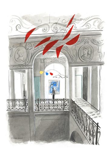
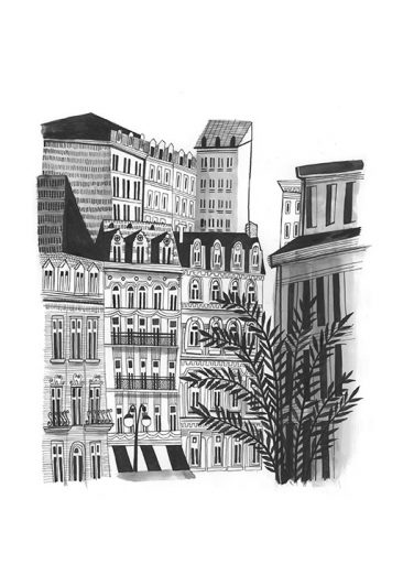
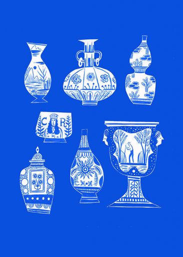
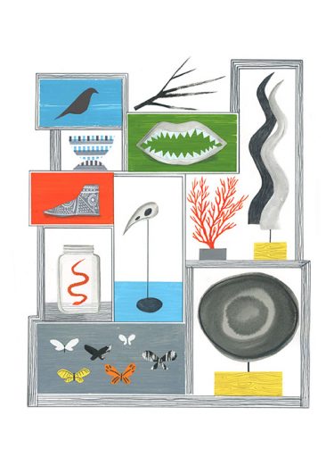
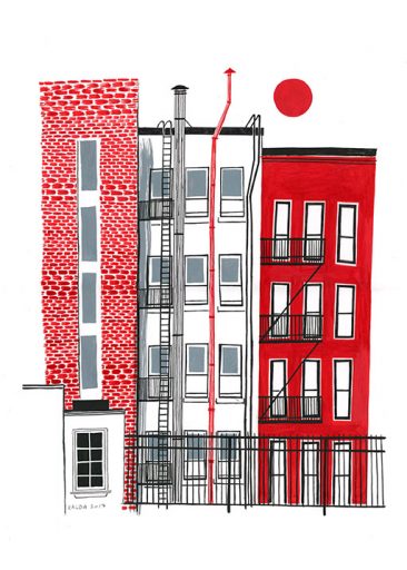
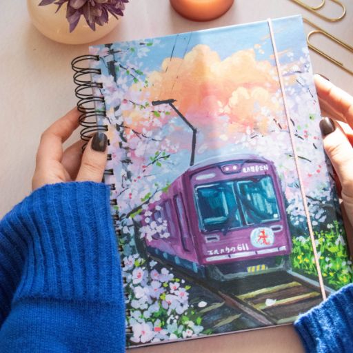
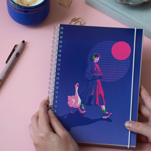
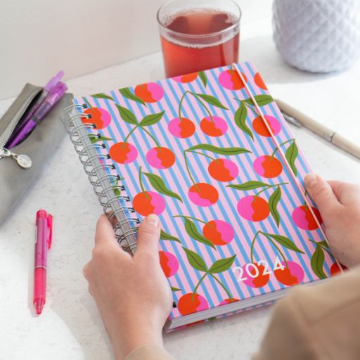
It’s time for a new addition to our image gallery: a collection of beautiful illustrations from the American artist Sam Kalda, ready to be on the cover of your planner or notebook. If you’re looking for something classy but also a little peculiar — this is the collection for you.
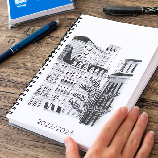
The images selected for So Typical Me focus on architecture, shapes, forms, and what Sam describes as “eccentric collections”. Let these illustrations take you on a stroll through a beautiful old city, or to a quiet museum with its many exhibits to explore. Will you go for timeless black & white or a bright pop of color sure to grab attention?
Head over to our design tool, click on the category “Collaborations” – “Sam Kalda” at steps 1 and 3, and see if Sam’s illustrations will become your ultimate favorites!
Meet Sam Kalda
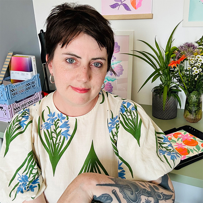
Meet Sam Kalda, an illustrator and artist with extensive experience from work on books, editorials, and in surface design. Besides his commissioned works and licensing projects, Sam is striving to maintain a painting practice as well.
Sam’s inspiration comes from encountering and experiencing different places: he loves going to museums, perusing antique shops for hidden gems and spending time outdoors when gardening or taking walks. He's also a book collector, an interest that you'll often find reflected in his work through references to vintage illustrated publications and art.
Sam describes that combining a paper planner with his phone calendar is his preferred method of planning as it helps him get things done and keep his life in order. For paper planning, Sam refers to a desk calendar and one of his many notebooks and sketchbooks.
For his So Typical Me planner Sam has picked the classic vertical layout in modern type. Would you choose the same layout as Sam, or would it be something completely different?


